
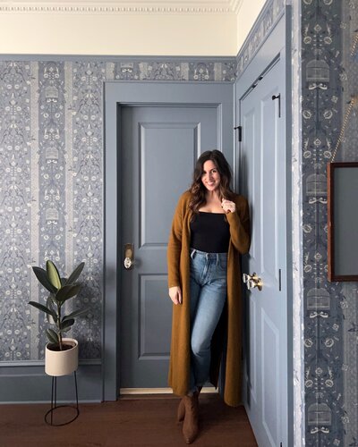
Contrast trim was the single most impactful design decision I made in our previous home. It’s such a great way to highlight beautiful moulding and doors, add interest to a space, or incorporate a pop of color. Even better? Contrast trim is budget-friendly and easy to achieve. Anyone can paint trim! But if it intimidates you, I have a blog post on that as well 😉
Is it ideal for every space? Not necessarily. What colors work best? Where do you start and stop in an open concept space? Like most things in interior design, there are nuances. In this blog post, I’ll cover everything you need to know about contrast trim!
Disclaimer: This post contains affiliate links. This means, if you purchase something from a link I provided, I will receive a small commission. This is at no extra cost to you! Thank you so much for the support!
What is Contrast Trim?
Contrast trim is exactly what it sounds like… trim that’s a contrasting color to whats on the walls.
Traditionally, white trim has been the standard and that’s not what we’re talking about here. Contrast trim, in interior design terms, is going to refer to trim thats basically any color but white. Later on in this post, I’ll share some interior trim color ideas!
Where to Use Contrast Trim
Contrast trim can really be used in any room, but it’s important to remember that the intention is to highlight trim work and features that deserve attention. If you aren’t a fan of the moulding in your home, or it’s lacking, painting the trim probably isn’t the answer.
Doors
If you’re nervous to try contrast trim, painting your doors is a great place to experiment! This is such an easy and effective way to add character and make your doors into a design feature.
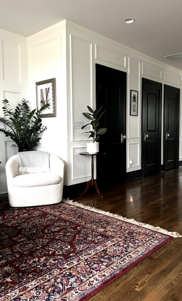
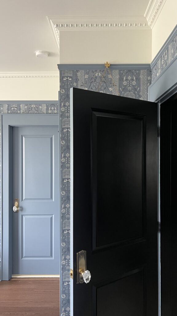
You can do a subtle contrast by painting your doors and door frames a darker color. You could do a few shades darker than what’s on the walls, or you can go bold and really make a statement. This works great in an area of the house where you have a lot of doors, such as a hallway or landing!
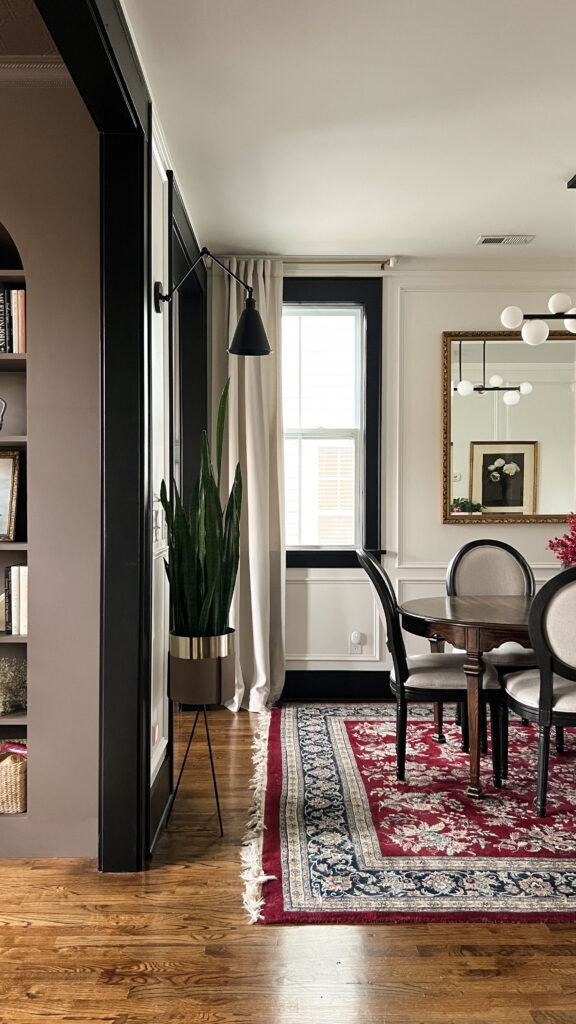
Window Trim
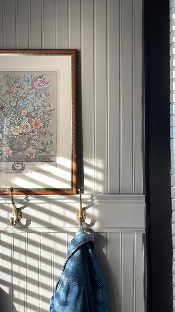
Windows already draw attention, so why not highlight the window casings to make them pop even more?!
Baseboards
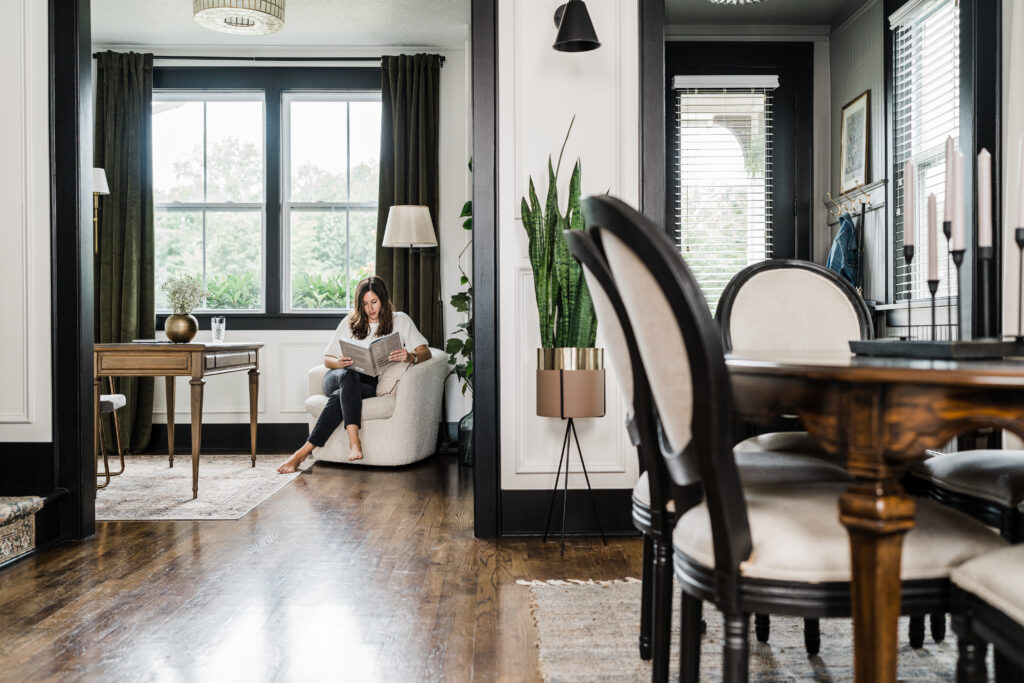
Painting baseboards a contrasting color can add depth to space. It just creates a more layered, sophisticated look. However, I only recommend painting your baseboard if you’re also painting the door casings. I think it might look odd otherwise.
Also, if you’re not a fan of your baseboards, I don’t think contrast trim is the best option. Painted baseboards look best if the baseboards are decent in size. If you have smaller baseboards and would like to try contrast trim, try beefing them up with some additional trim. My go to trim to add above baseboards is base cap moulding. I’ve also seen door casing or chair rail used for an even more substantial look.
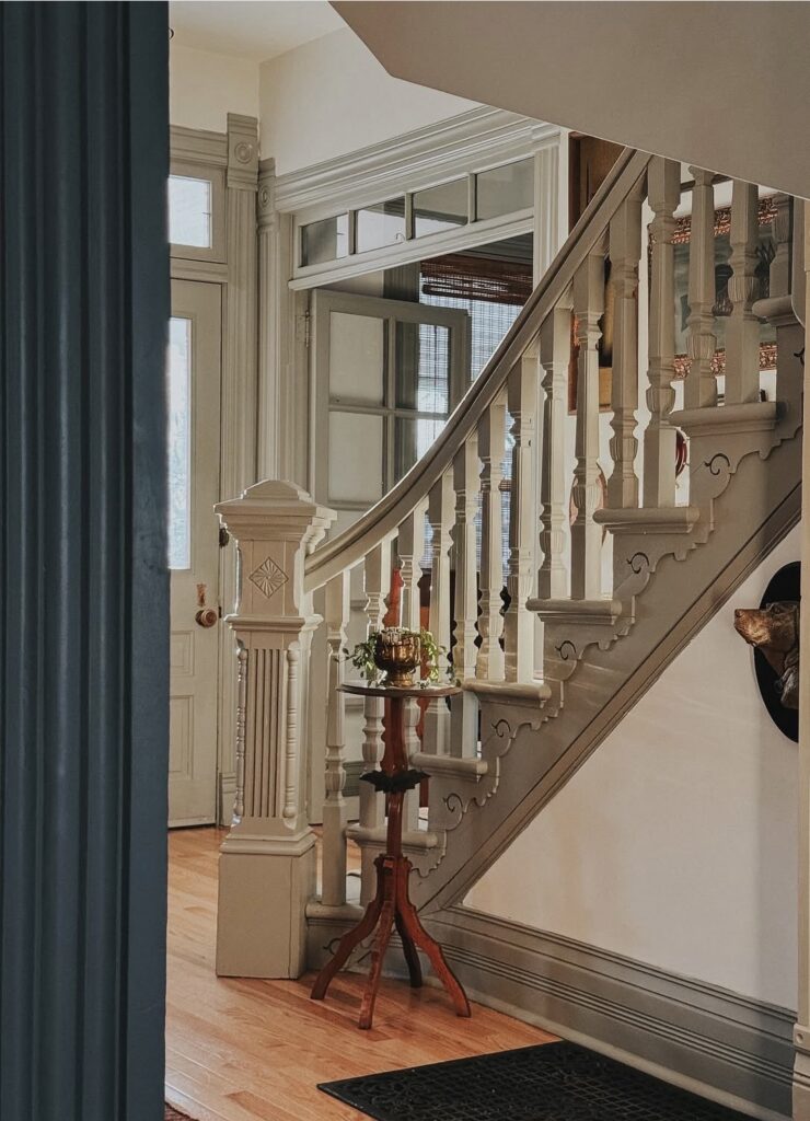
Crown Moulding
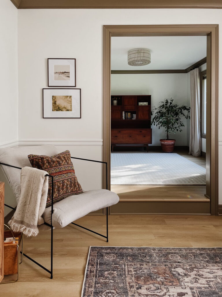
Architectural details like crown moulding are always a charming touch to a home. Contrast trim is the perfect way to highlight this feature and create a more custom feel.
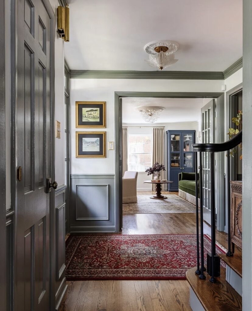
Built-Ins
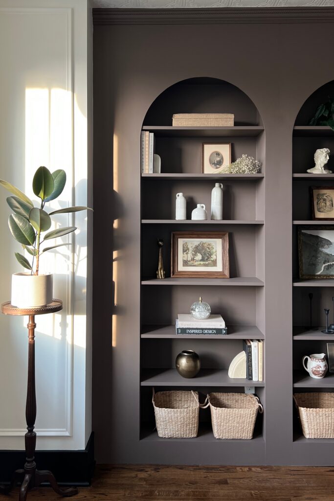
Contrast trim doesn’t have to be limited to doors, windows, and baseboards. If you have built-in bookshelves or custom cabinetry of any kind, choosing a contrasting color is the perfect way to make them a focal point. This is another great way to slowly introduce color into your home.
I did this with my DIY billy bookcase built-ins. Initially I painted them a contrasting color, but I loved the color so much I ended up color drenching the whole room.
Ceilings
Don’t forget about the 5th wall! Ceilings are often an afterthought (or not a thought at all) when designing a space, but they really have so much potential. If you have a ceiling treatment you love, painting the ceiling a different color will draw attention to it!
Trim Color Ideas
First, let me start by saying that there are so many great trim colors other than white. But I also understand that it’s very overwhelming choosing paint colors… I’m here to help! Below are some specific interior paint color ideas for a high-contrast look or not much contrast.
But don’t forget- this is just a teeny tiny list of ideas and you can choose whatever trim color you want!
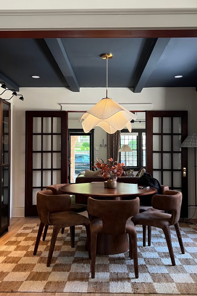
Warm Neutrals
- Sherwin Williams Accessible Beige (this is one of the most popular choices!)
- Sherwin Williams Shiitake
- Farrow & Ball Jitney
- Farrow & Ball London Stone
- Benjamin Moore Revere Pewter
- Benjamin Moore Mocha Cream
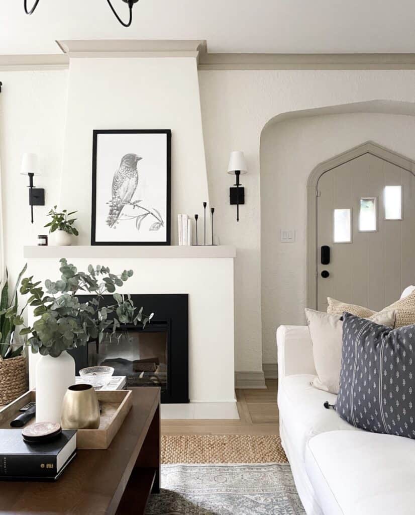
Bold Colors
- Sherwin Williams Urbane Bronze
- Sherwin Williams Black Fox
- Farrow & Ball Brinjal
- Farrow & Ball Railings
- Benjamin Moore Black Beauty
- Benjamin Moore Fading Twilight
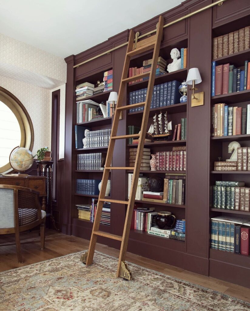
Shades of Greens & Blues
- Sherwin Williams Debonair
- Farrow & Ball Mizzle
- Farrow & Ball Blue Gray
- Benjamin Moore Intrigue
- Benjamin Moore Vintage Vogue
- Benjamin Moore Hale Navy
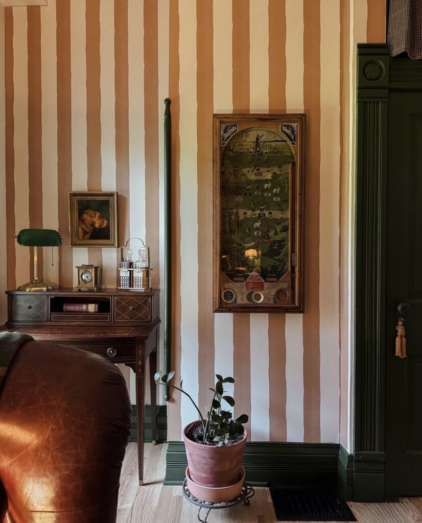
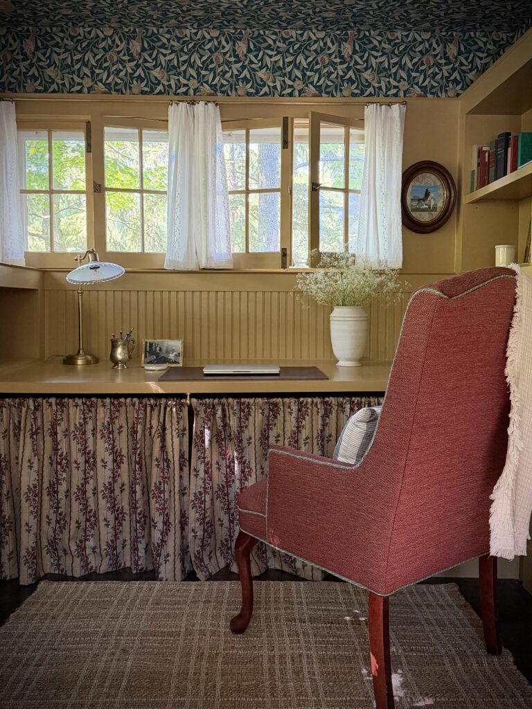
Pull a Color From Your Wallpaper
This is one of my favorite variations of contrast trim! If you have a colorful wallpaper, you can pull one of the colors from the pattern and use that to paint your trim. I also love when there’s a contrasting trim color that isn’t pulled from wallpaper, but compliments it and just adds a little extra interest.
Go for a Monotone Look
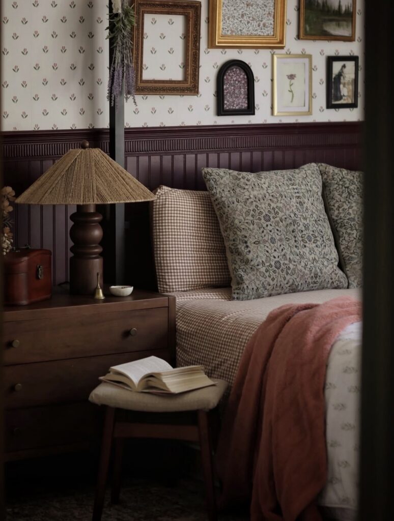
Another fun way to incorporate contrast trim is to choose a color that’s a couple shades darker than your wall color. This is such a subtle, but impactful look and I personally love seeing the different shades layered throughout a space. I think this approach would be a great choice if you want to use more color in your home, but in an understated way.
Frequently Asked Questions
Is Contrast Trim Trendy or Timeless?
Contrast trim has definitely been popping up more and more on Pinterest and Instagram over the recent years. People are embracing warm colors and straying away from the all-white interiors. So in that sense, yes, I’d say contrast trim is trendy at the moment.
However, the concept isn’t new. Historic homes often feature stained wood trim, rich colored interior doors, or painted moulding.
It’s all in how you execute. If you take a chance on a bold, trendy color, it can date a space more quickly. If you’re going for a timeless approach, choose a color that you know you’ll still love years from now. You’ll also want to consider your home’s style or architecture!
Can You Do Contrast Trim in an Open-Concept Home?
Yes! I did it in my open-concept home! The key is to create a sense of continuity throughout the main living area. Choose one trim color that works in the dining room, living room, etc. I highly recommend testing paint colors. Test them anywhere you plan to paint and see how it looks at different times of day. Painting trim is a pretty big commitment, so take your time. When you’re testing paint colors, you can either use Samplize or go to the paint store and buy the small paint pots!
Another key is transitioning properly. For example, you might have an interior door that’s painted two different colors on each side. You’ll paint the edge of the door the color of the room it’s swinging into.
Is Trim Suppose to be Lighter or Darker?
It can be either! A light color trim is a more traditional look. Dark trim creates a high contrast look which really emphasizes the architectural details.
What Rooms Look Best with Contrast Trim?
Contrast trim can work in any room, but it’s most impactful in rooms where you want to highlight the architectural features!
What Type of Paint Finish is Best for Interior Trim?
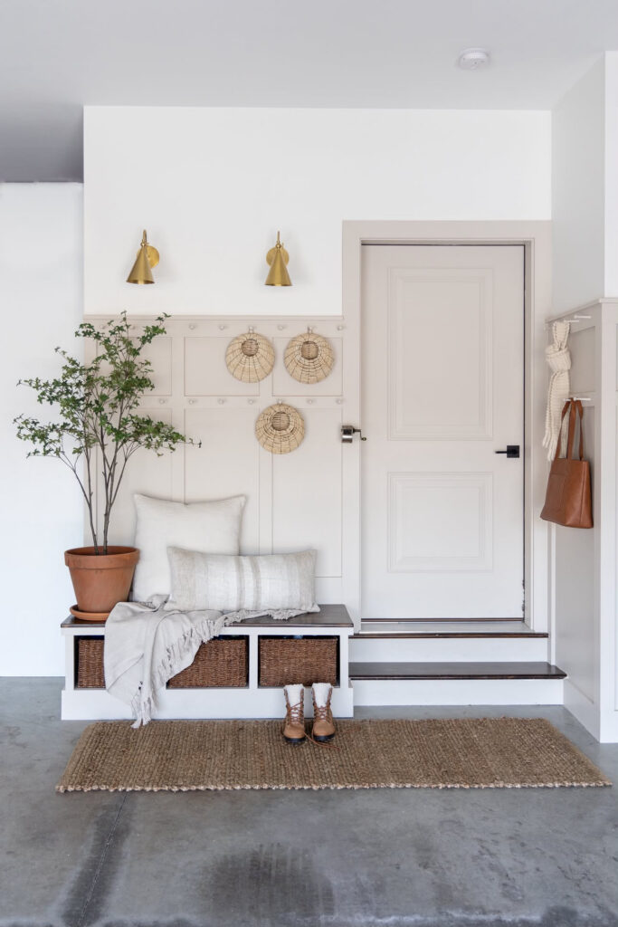
One of my most popular blog posts is How to Paint Trim and Why Satin is the Best Finish. I’m sure by the title of the post you can gather that I love to use a satin finish on trim. It’s my go-to. However, I also love a higher sheen like semi-gloss or even gloss, depending on the trim and the overall aesthetic.
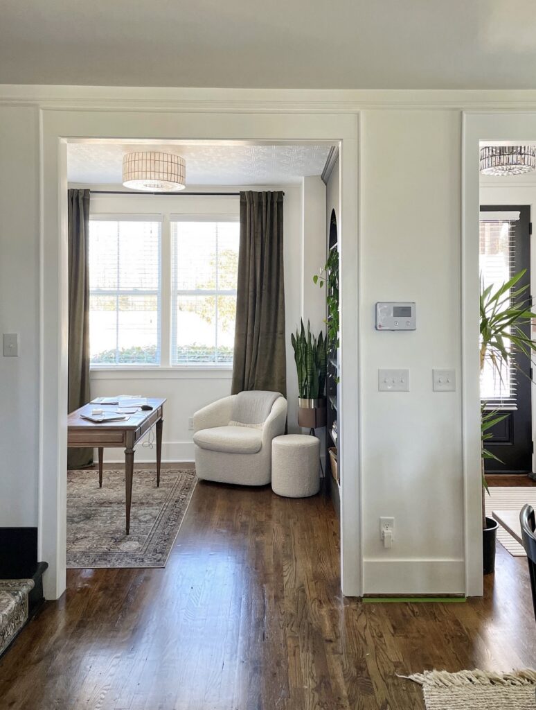
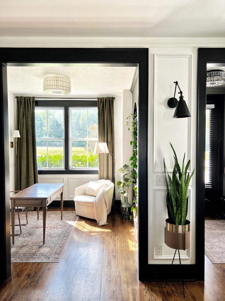
Painted Trim Before and After
I had to include this before and after to show you just how impactful contrast trim can be!! Our home had an entirely different feel in the absolute best way.
For reference, the white paint color is Timeless by Clare Paint and the black is Limousine Leather by Behr.
I hope this post was helpful!! Thank you so much for being here!
Elisha